Subtle
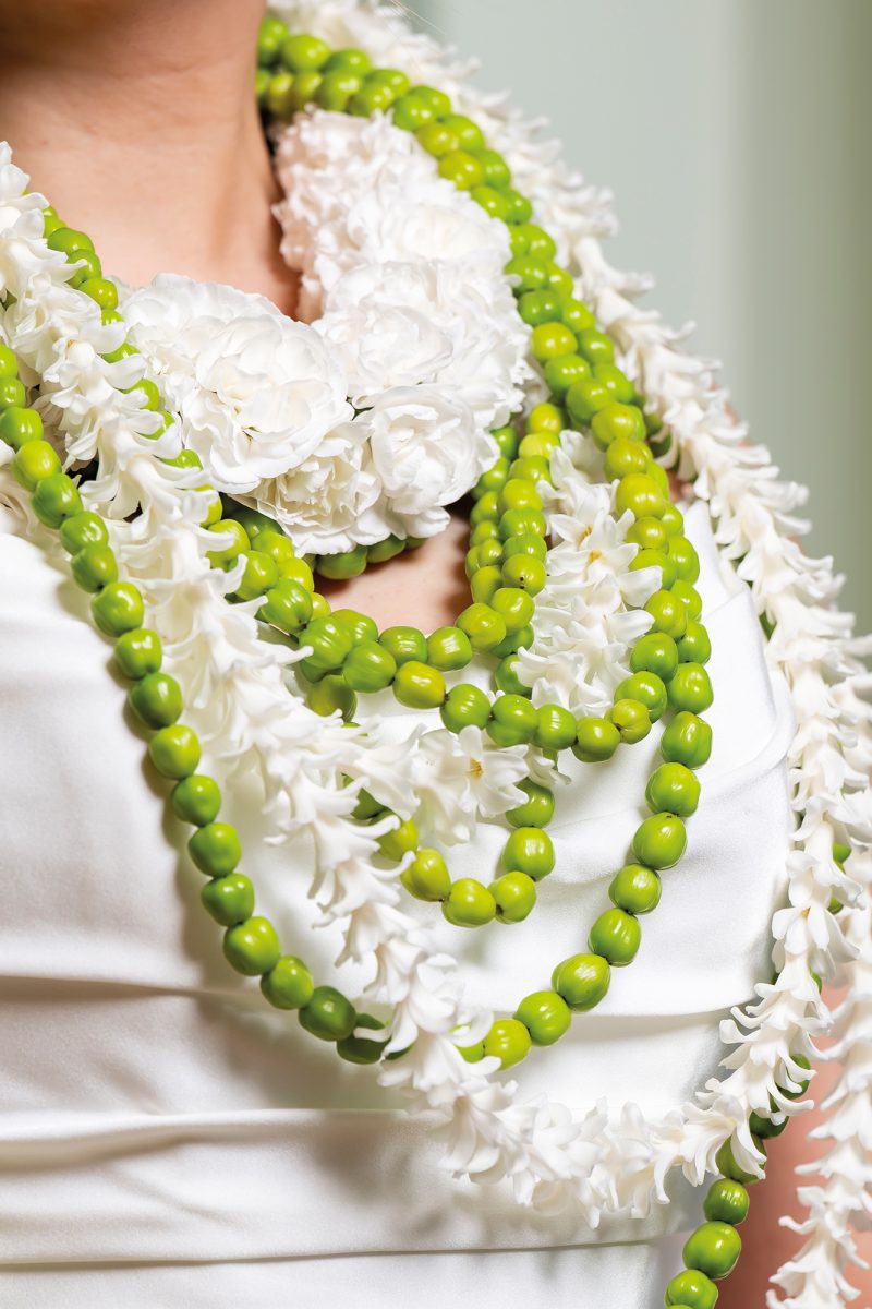
These necklaces are exquisitely crafted from Hypericum ‘Sisu Charm’, white cluster carnations, and hyacinth nails. They display a subtle interplay of form, rhythm, and proportion. In their individual variations—sometimes slender and understated, at other times slightly fuller and more layered—each possesses its own quiet beauty. It is precisely in their interplay that their power unfolds: together they form an elegant, almost sculptural necklace, in which softness and structure balance each other.
A bunch of spring

This spring bouquet has a frame made from a 3D-printed snow star, which has been covered with dried Limonium crumbs using cold glue from Smithers Oasis. This frame has a long shelf life and can be used many times. The bouquet features new varieties of Astilbe and Achillea from Marginpar, Gloriosa, Clematis Amazing Kibo, Tillandsia, Papaver, ranunculus, carnations, and Phalaenopsis.
Organic shapes

The colorful and organically shaped frame of this bouquet is made entirely with a 3D pen. The filament used is made from renewable, plant-based raw materials such as corn, sugar cane, potatoes, or sugar beets. This makes it biodegradable and sustainable. The material is strong, yet still flexible at this thickness. The bouquet is composed of airy, field-like flowers such as Gloriosa, Clematis, Achillea, Papaver, carnations, and Craspedia.
Powerful fan
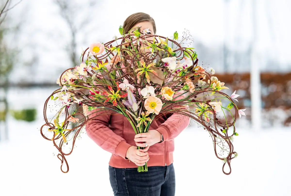
The powerful fan shape of this bouquet is formed by aluminum wire, wrapped with copper bouillon wire using a drill. The bouquet consists of flexible flowers, which creates transparency. Gloriosa, Sanguisorba, Clematis, Talinum 'Long John', Tillandsia, Papaver, carnations, and Phalaenopsis are used here.
Signature Bouquets

Over the years, every floral designer develops their own signature style. Not a fixed formula, but a recognizable way of working: choice of materials, proportions, technique, and atmosphere. In this special edition, DPK Floral Magazine brings together DPK Floral Magazine selection of such signature bouquets: designs in which personal style and craftsmanship take center stage.
‘Keep your eyes open for new techniques’
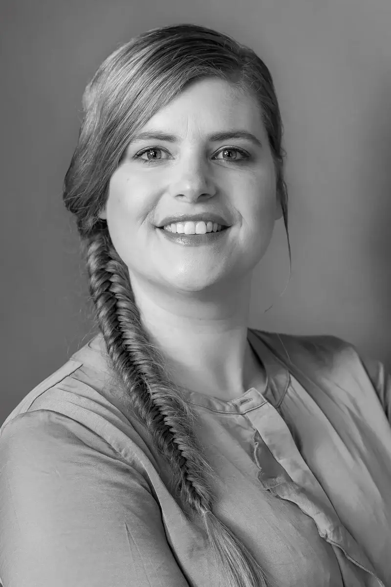
Floral designer Hanneke Frankema believes it is important to continuously develop and innovate. That is why she is always open to new techniques and materials. For her, experimentation is not an end in itself, but a logical part of her creative process.
She has a particular preference for wire. "It's not for nothing that I'm called 'the iron lady'. Wire is a beautiful and versatile material, and it's also practical: frames and rolls of wire are easy to transport and reusable." In addition to wire, Hanneke is also enthusiastic about new technological possibilities, such as 3D printers and 3D pens. These techniques can be used to create virtually any desired shape, which allows for even more freedom in the design process.
The floral objects she creates are very diverse, but always striking and unique. Despite this wide variety, her signature style is clearly recognizable. She often works with unusual frames and surprising combinations of colors and materials.
‘I particularly like the contrast between natural materials and other materials. I also enjoy playing with unusual colors and shapes.’