French master florist Frédéric Dupré is known for his unique interplay of texture and color. He teaches masterclasses around the world and has been honored with the prestigious title of Meilleur Ouvrier de France (MOF) for his craftsmanship. His work is characterized by the use of unexpected materials and his in-depth knowledge of floral composition.
That conviction forms the basis of an intensive five-day master class that integrated theory and practice. Over the past ten years, Frédéric has developed his own design method, in which textures are categorized into families and subfamilies. This allows them to be applied not only intuitively but also very deliberately. “Texture deserves just as much attention as form, line, and geometry,” he emphasizes. “Only when you understand how materials react to light and how different surfaces influence one another can you consciously steer a design.”
For floral designers, this means a different way of looking at things. The focus is no longer on which materials combine beautifully, but on why they do. Matte, satin, and glossy surfaces all reflect light differently, thereby influencing the appearance of a material, but there are also subfamilies that influence the emotional experience of a design. According to Frédéric, it is precisely this interplay that creates a more powerful end result.
Geometric Wall Object “
” He created a square wall decoration with a strong architectural character. Because it is a wall object, it is more two-dimensional than a traditional floral arrangement. However, that does not mean that depth and layering are any less important. The primary material was wood, which naturally has a matte texture. By applying varnish and paint, the wood was given an artificial, glossy texture. The design plays with contrasts between geometry, repetition, and positive and negative space. For example, the geometric squares are repeated. In addition, the delphinium has a triangular shape that is echoed in the agave leaf. Furthermore, both are incorporated upside down. The delphinium is supplied with water via sealed tubes.
The structure has a powerful, masculine appearance, while the botanical materials add a refined and feminine touch. According to Frédéric, Tradescantia has a somewhat more restless character and is therefore used in a more compact arrangement. If you look closely, you’ll see that it’s combined with a cascade of dark seaweed, a material he also used for his work *Dutch Coast Line* during the World Cup.
's Bold Glass Vase Another design focuses on the contrast between bold and soft textures. For this piece, Frédéric used cacti, dried Poncirus branches, various types of nuts, and Phalaenopsis orchids.
He demonstrates how materials with vastly different surface textures can still be brought together harmoniously. The Phalaenopsis serves as a unifying element: it links the dry materials to the color palette and breathes life into the composition.
The vase itself is also part of the story. Its rounded geometric shape echoes forms found in the botanical materials. The surface was also modified by gluing cactus spines to the glass, giving it a more aggressive look.
Transparency also plays an important role. The design incorporates several compact zones within an otherwise airy composition, creating a sense of spatial contrast and elegance.
Displacement Arrangement with a gourd
Another important concept explored during the seminar was the Displacement Arrangement. Frédéric interpreted this technique—known from the work and teachings of Gregor Lersch and covered at an advanced level in the International Master Florist program—in his own unique way. His approach is more architectural and places greater emphasis on texture.
For this design, he used a long, dried gourd from his own garden. After drying, the surface takes on a particularly interesting appearance: organic, irregular, and full of character. As a result, the gourd’s texture blends naturally with the wooden base.
The botanical elements are then incorporated in a more garden-like manner. The composition has a calm, downward flow with organic lines, shapes, and textures.
The color scheme remained soft, featuring light shades of green and pastel colors. Yet the floral designer added bold pops of color with Kalanchoe schizophylla, a rare and unique botanical element. That is precisely where an important subtlety lies: even within a pastel palette, a small touch of vibrancy can add energy and movement. It’s all about balance. Too much would disrupt the atmosphere; just the right amount brings the design to life.
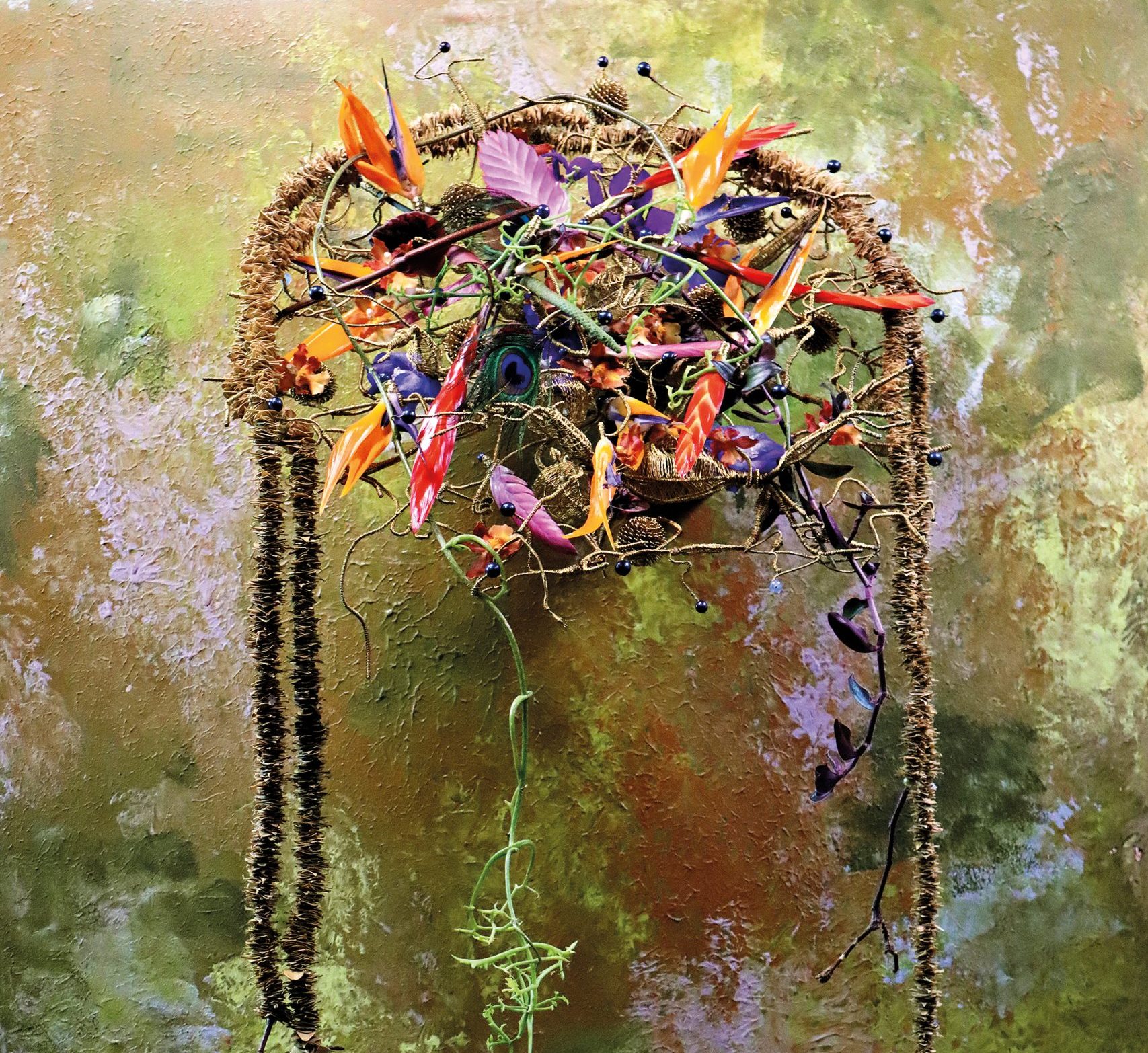
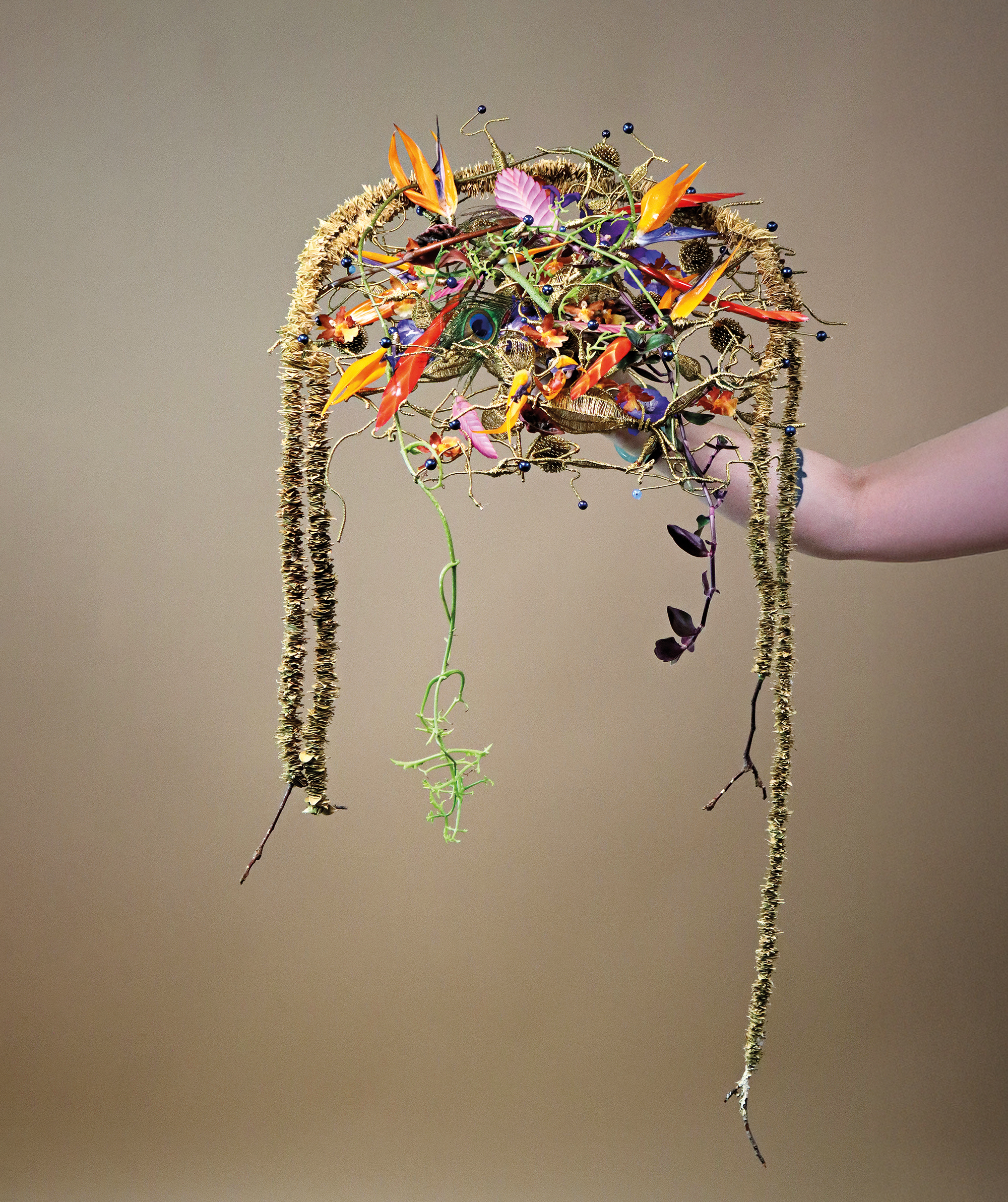
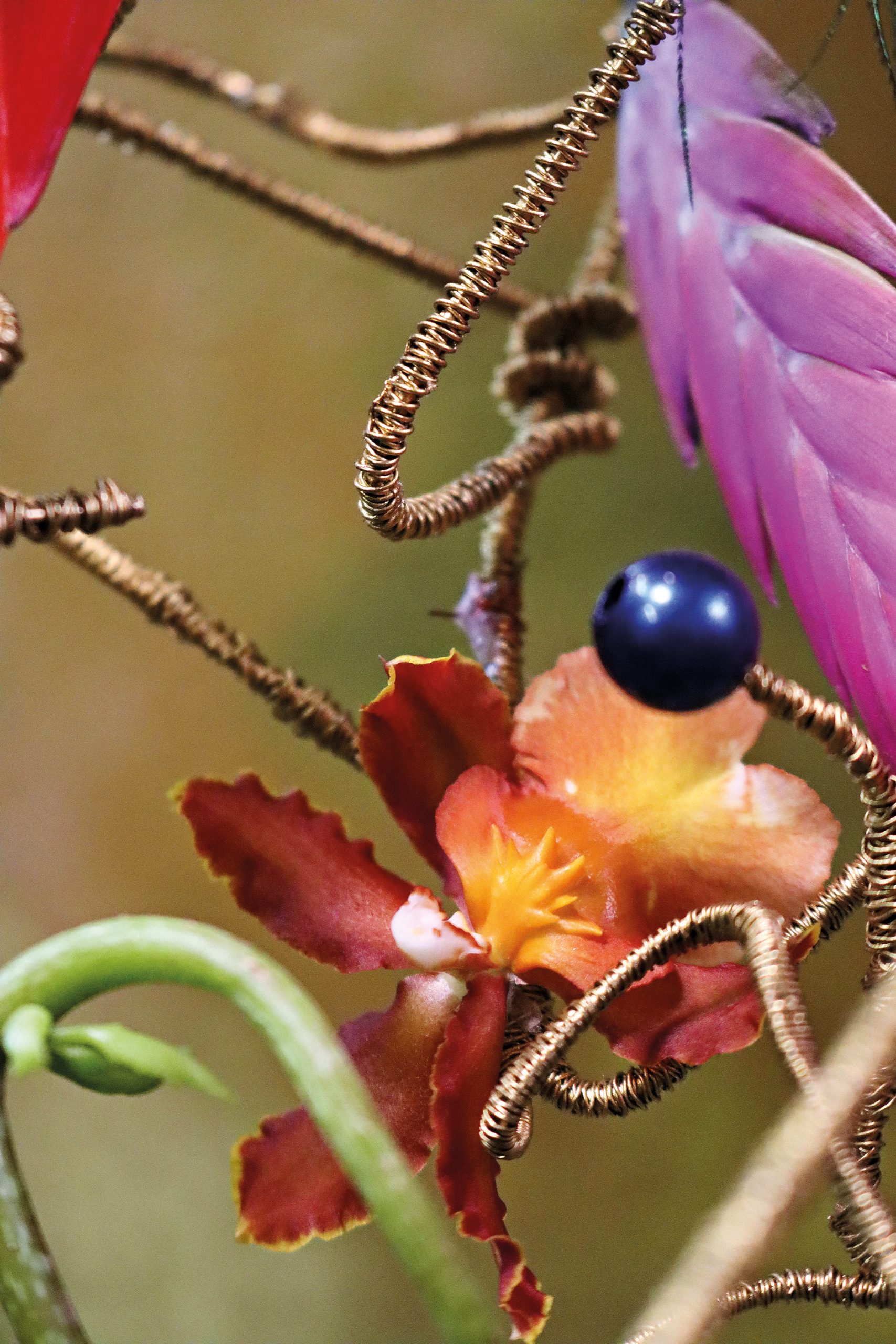
’s Metallic Bridal Bouquet In this bridal bouquet, Frédéric explores what he calls a more artificially created texture. The inspiration came from the tubers of the dahlia—the hidden vascular structures beneath the flower.
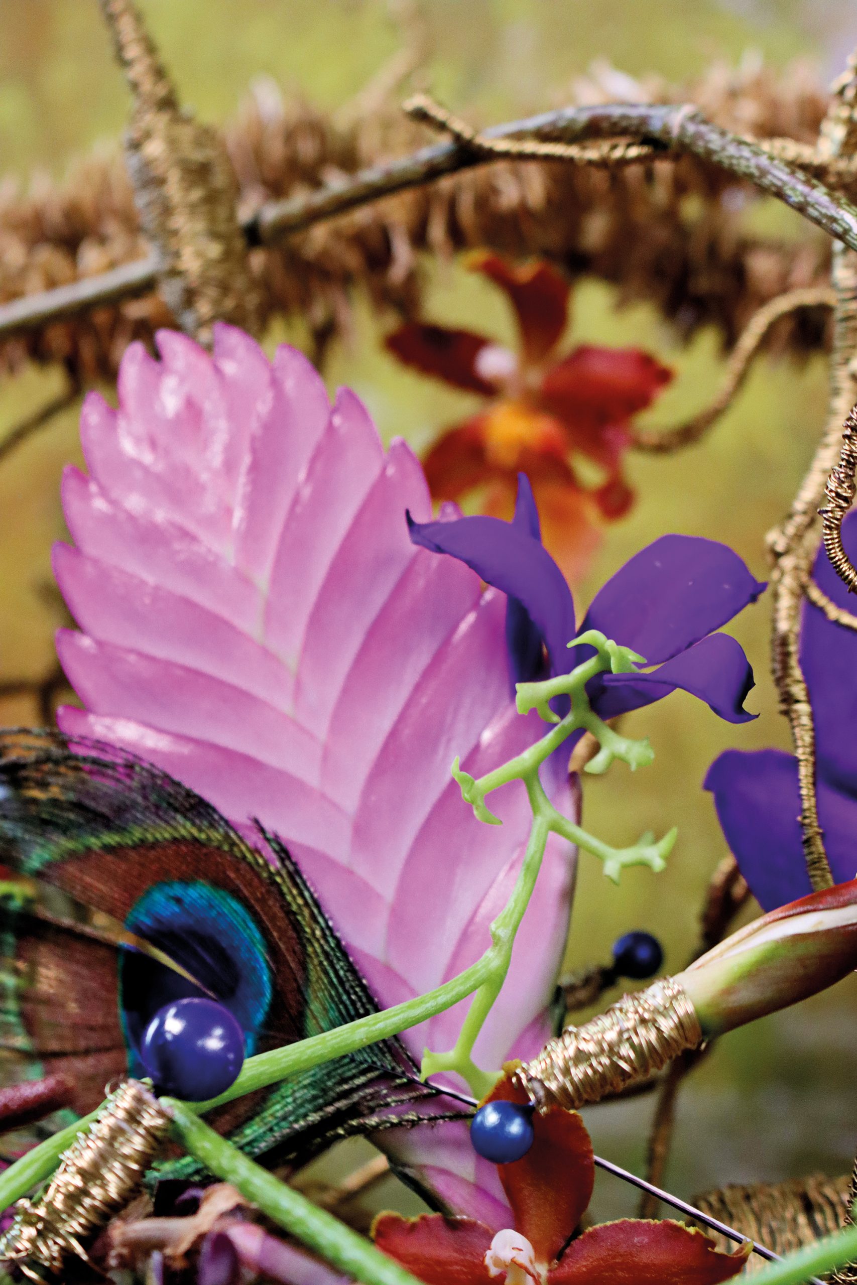
Using the well-known spider-web technique, he created a structure that had an artificial look even before the flowers were added. This impression was then reinforced by the choice of botanical materials. The Strelitzia served as the starting point for the color palette and naturally introduced orange and blue into the design. Blue pearls complement this, while the other flowers create a color gradient ranging from red to pink.
Frédéric plays with different intensities within the same color family: sometimes deeper and redder, sometimes softer and pinker. Purple, brown, and beige serve as connecting shades. Many of the materials used have a silky-glossy texture, which enhances the harmony in the bouquet’s use of textures. Here, too, Kalanchoe schizophylla creates an elegant, organic line among the more angular, botanical materials.
The bouquet is displayed on a painted wooden board in a soft pastel shade of green. The colors of the background and the bouquet complement each other and together form a single, cohesive image.
’s Hanging Plant Arrangement The final project of the seminar was a large, hanging plant design. For Frédéric, this was also a personal statement. Before becoming a florist, he worked as a landscaper and garden architect. Plant arrangements are therefore an important part of his identity as a designer and are among his favorite ways to express himself creatively.
With this work, he wanted to clearly showcase that side of himself. During competitions, designers are often limited by the botanical materials made available to them. Especially during the World Cup, he felt that the variety of materials did not allow for complete creative freedom. In his view, there was a lack of variety in size, shape, and especially in wire materials. As Frédéric himself says: “As a florist, I can only work with the materials that are available. I’m not a magician.”
In this hanging installation, he had the freedom to fully express his connection to plants—Frédéric began his career as a gardener. The work was constructed entirely from organic and biodegradable materials. It also incorporates many upcycled structural elements from previous designs: coated wire, pieces of wood, and salvaged materials, such as dried Anthurium veitchii and Heliconia ‘Bloody Mary,’ which Mike Boerma had left over from his Dutch championship entry.
The floral designer also regularly saves parts of previous designs to reuse them later. Sometimes he even combines elements from different older works to create something entirely new. For him, this is not only practical but also necessary. Like any creative discipline, the art of floral design must take sustainability and the planet into account.
The wire structure echoes the forms of the Heliconia. Line, transparency, symmetry, repetition, and geometry also play an important role here. Materials such as bromeliads and dried Cryptomeria branches came from Frédéric’s own garden, making the work personal, sustainable, and unique.
Texture Provides Cohesion
A common theme emerged in all the designs: texture is the glue that gives a design its cohesion. It can completely transform a design and should therefore never be underestimated. By developing a clear theory on texture and color, Frédéric provides florists with a new toolkit for their designs.
The students who participated in the seminar said that Frédérics’ theory completely changed the way they think about design. This approach opens up new possibilities. Instead of simply wondering whether materials go well together, they learn why they work, how they influence each other, and what story they tell together. The five days were exceptionally intensive, and further practice remains necessary, as with anything new. But one thing is certain: the participants’ toolbox is now well-stocked.